Exploring component variations that adds impactful engagement.
Contribution
UX Research | Mockups | Reviews
Core Team
Annalisa Swank
Challenge
– Page length needs to be shorten
– AEM component enhancements that can successfully be added to the new system
– Addressing user frustration
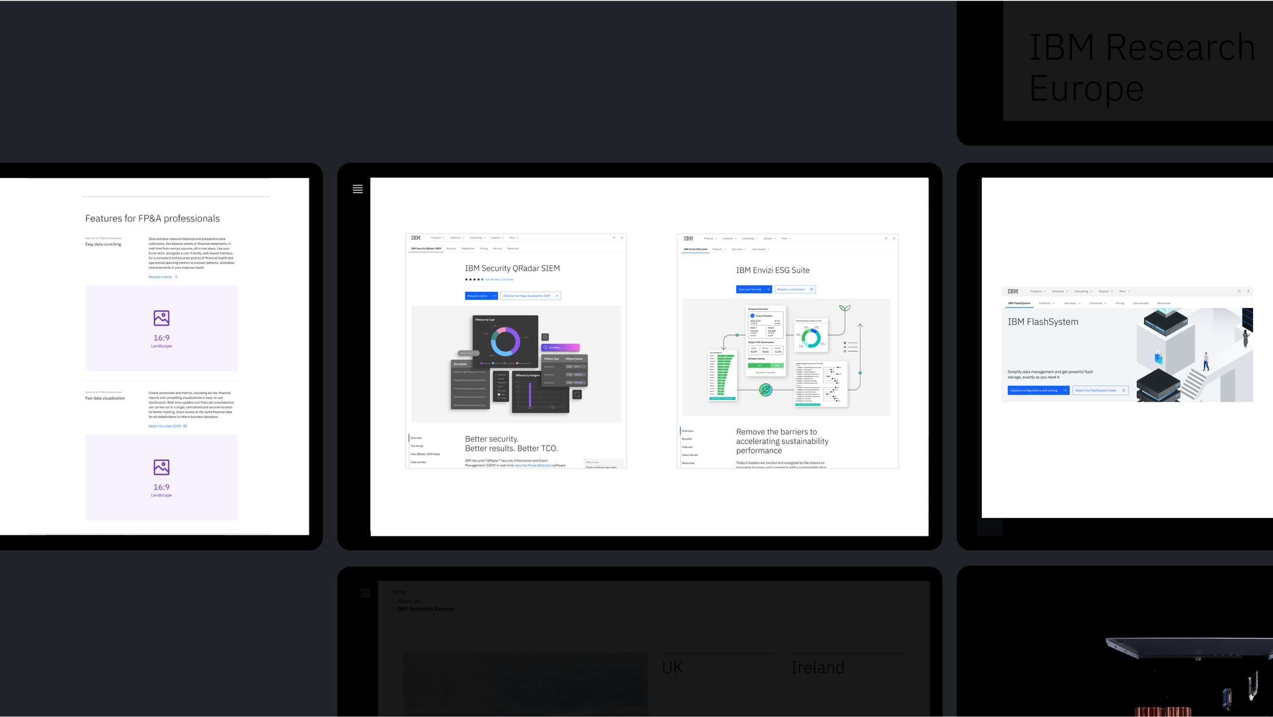
Component 1

Leadspace
For leadspaces, it’s helpful to have a component option with a prominent CTA and a description which provides clear next steps.
While designing pages for the PA team, user testing resulted in a need for CTA and description within use cases. This CTA is also in line with the product’s competitors.
Component 2

Tabs
In showing product features, it’s helpful to have the option for tabbed content which helps reduce overall page scroll.
This component variation could be incorporated from the Product Overview page template.
Component 3
Quote
In showing a quote, a client photo brings visual impact and personality to the statement.
This component variation doesn’t exist in Figma but could designed if available in AEM.


Visual Exploration
Product visuals
Visual Exploration
Product visuals

User testing
L0/L1 Navigation
The insights from Decibel and current UX research work are providing data on where people are clicking across each tab. Results concluded that users were getting confused between the top and lower navigation due to content labelling, lack of tab separation and experience.

Navigation component
L0/L1 Navigation
Small design change, big impact. Due to confusion between L0 and L1 we recommended to create an obvious separation by adding a gap in between the L0/L1.
